Pra entender a inovação, nada melhor que saber um pouco sobre sua estória. Achei esta matéria muito interessante (indicada por um amigo meu).
The Logo Evolution of 15 Corporate BrandsNov 22, 2010 / Category : Misc / CommentsAs we already know that Logo is the identities that are fundamental to building a brand and communicating with the target audience. Probably you have seen most of these logos everywhere, but have you ever wondered about their evolution, their background? Did you know that Apple original logo was Isaac Newton under an apple tree or have you ever wonder where the Mercedes-Benz Brand And The Three-Pointed Star logo came from? Below we listed 15 Corporate Brand Logo Evolution with their fascinating stories.
Apple
It is one of the biggest consumer electronics and Software Company, best known for products like Macintosh, iPod and iphone. Steve Jobs, Steve Wozniak, and Ronald Wayne had together setup Apple in 1976, to sell their hand-built computer Apple I. They had offered their product to HP first but were declined by them. I think HP would still be regretting this today.
The road to success wasn't easy for Apple, and Wayne liquidated his share in the company for a mere $ 800. After the launch of Apple II in 1977, things started to look up for Apple and we all know what heights the company has reached since then.
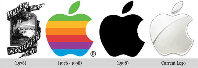
Apple II was successful mainly because it had colored graphics. Great and simple design, has always been the USP (Unique Selling Proposition) for Apple, and their logo is no exception. When Apple was started, the logo was a complicated picture of Isaac Newton sitting under a tree. This had been designed by Jobs and Wayne, with the inscription: "Newton ... A Mind Forever Voyaging Through Strange Seas of Thought ... Alone." Frankly, I don't think it was just a coincidence that Apple had slow sales during this period.
However, Steve Jobs hired Rob Janoff to simplify the logo, which turned out to be a great idea. Rob created the ‘Rainbow Apple' which was the logo for company till 1998. There are many rumors as to why Rob had chosen to create such a logo. One of them says that the Apple was a tribute to Newton (discovery of gravity from an Apple), and since the USP for Apple at that time was colored graphics, it had the rainbow colors. Another explanation exists that the bitten apple pays homage to the Mathematician Alan Turing, who committed suicide by eating an apple he had laced with cyanide. Turing is regarded as the father of computers. The rainbow colors of the logo are rumored to be a reference to the rainbow flag, as homage to Turing's homosexuality.
Janoff, however, said in an interview that though he was mindful of the "byte/bite" pun (Apple's slogan back then: "Byte into an Apple"), he designed the logo as such to "prevent the apple from looking like a cherry tomato."
When Apple launched the new iMac in 1998, they changed their logo to a monochromatic apple logo, almost identical to the rainbow logo. Now, the Apple logo comes with nice gradient chrome silver design. It is one of the most recognized brand symbols in the world today, and the shape is what identifies the company more than the color.
Audi
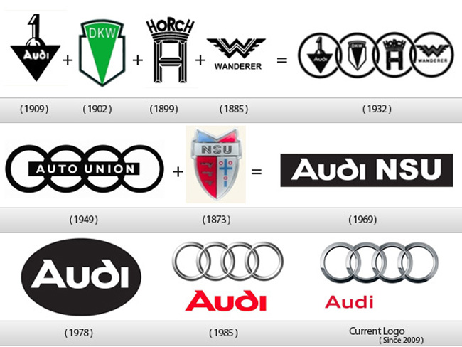
Audi is a German brand which produces cars and is a part of the Volkswagen Group. The company was founded as A. Horch & Cie by August Horch in 1899, and its origin has a very interesting story. August Horch, a German Engineer, was forced out of his own company in 1909, after which he continued to use the old brand name of Horch. However, his partner sued him for trademark infringement, and Horch was forced to look for a new name.
After this the company was named as Audiwerke GmbH in 1910. In 1932, four car makers Audi, Horch, DKW, and Wanderer merged to form Auto Union. The four interlinked rings that would later become the modern Audi logo, was originally the logo of the Auto Union. Initially the Auto Union logo was used only for racing cars and the four companies continued to produce cars under their own brands. Finally in 1985, the Auto Union became the Audi company we know today.
in 2009, Audi introduced new logo which is also the current one. The modern Audi logo shows a three-dimensional texture and shadowing, resulting in a polished chrome look. The Audi name is now smaller, has moved away from the center to the bottom left corner, while the font has changed as well.